
Tyrone’s top uniforms ranked
One of the may aspects of college football that sets it apart from other versions of the game is its hold on tradition. Universities themselves try their hardest to foster an appreciation for their legacies, and this filters down to their sports teams, nowhere more so than on the gridiron.
As a result, uniforms play an important role. When one witnesses the simplicity of white pants (no stripes), navy jerseys, and plain white helmets with a single blue stripe, that team can’t be any other than Penn State. The look stands for the program and its ethos as much as Beaver Stadium white outs and chants of “WE ARE.”
The same can be said for any number of college programs. At Notre Dame, it’s gold helmets decorated with paint containing real gold flakes, harvested directly from the Golden Dome on campus. In Ann Arbor, it’s the iconic winged helmets donned in maize and blue. For Alabama, it’s crimson flame helmets with white numbers on the sides, capping the same crimson and white uniforms worn in the days of Joe Namath.
The simple fact is, a team’s uniforms can speak volumes about who a team is and what it stands for, so consistency is quite often highly valued. While teams like Oregon have made uniform combinations the staple of their iconography, for the blue bloods, their traditional looks have become inseparable from the programs themselves because they do more than announce the team’s name. They also reflect what the team is all about.
But even the blue bloods experienced shifts in their presentation before landing on the ones that we see today. Penn State famously began its football program in 1887 wearing pink and black uniforms. When the colors faded over the years to something resembling navy and white, the look stuck. And even then there were times of flux, like in the 50’s, when the Nittany Lions had a stripe on their pants; or the 60’s, when they featured numbers on the sides of their helmets.
In South Bend, there was a period of four years in the 1960s when the Fighting Irish fiddled with the idea of helmet logos like shamrocks and numbers.
But ultimately, blue blood programs settled on the classic looks fans are familiar with today. Long before branding had become a concept, each teams’ look stuck as a result of tradition.
Tradition and traditional looks permeate high school sports every bit as much as college, and some program’s uniforms have reached iconic status. A perfect example would be the black-on-black uniforms of the Permian Panthers, punctuated by white helmets displaying a black letter P. That’s the style on display in the cinematic version of Friday Night Lights, and it’s the same one the Panthers use today.
But you don’t have to visit the stadiums of West Texas to find tradition. Woodland Hills, in the suburbs of Pittsburgh, has donned turquoise helmets decorated with black Michigan-type wings since it opened in 1987. The Viking horns on Pittsburgh Central Catholic’s shells have become a look inseparable from the team itself. Mount Carmel has worn red helmets with a single white stripe to complement red-on-red for more than 50 years. Even locally, the script “BA” on the helmets of Bellwood-Antis first arrived in the early 1980s, along with yellow and blue ringer socks, and both remain staples of the Devils’ look to this day.
At Tyrone, for the better part of the last 30 years, the look of the Golden Eagles has been every bit as iconic and consistent as gold helmets at Notre Dame or black shoes at Penn State. When Coach John Franco arrived in 1994, his first team wore a uniform that was a holdover from the 1980s – orange pants, black jerseys, orange helmets. But within a year, he had switched to uniforms chosen, he once said, for their simplicity: white pants with three alternating stripes (black-orange-black), black jerseys trimmed in white (or white trimmed in orange on the road), and white helmets with three alternating stripes down the middle and a single orange T on each side.
The first year the Golden Eagles wore those uniforms in 1995, the team went 12-2, won the District 6 2A championship, and played in the PIAA final four.
For a coach like Franco, who believed deeply in procedures and habits, the new duds weren’t going anywhere, and they remained unchanged, save for some minor alterations from 2014 through 2018, until the current day.
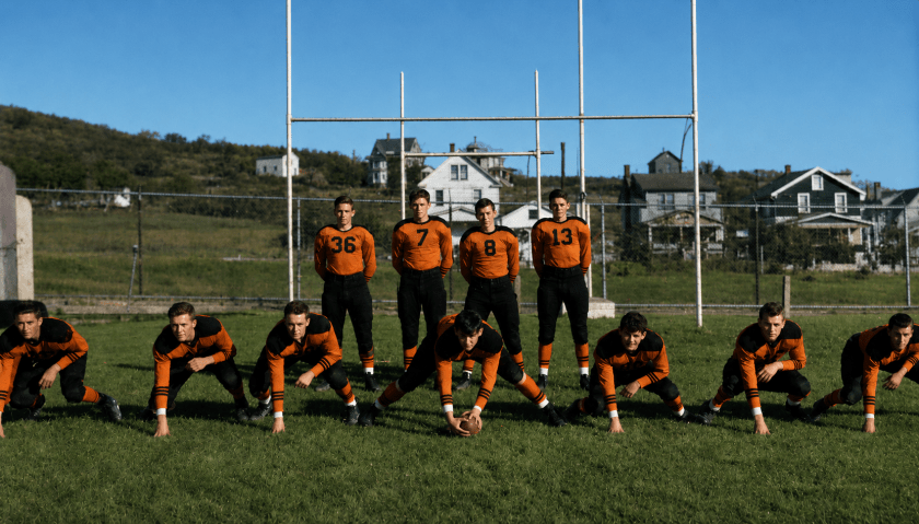
But as is the case with a team like Miami, which long before the U wore green and gold, Tyrone’s uniforms and overall look have changed many times in more than 100 years of football, often in dramatic fashion. There was an era in the 1970s, for example, when the team wore white when playing at home. Helmet logos have ranged from a T to numbers to an eagle. There was even a brief period in the 1950s when the team abandoned the school colors altogether and switched to black and gold.
This series will examine some of the different uniforms Tyrone has worn since first fielding a varsity team in 1921, ranking them in order. Those selected were chosen based on their aesthetic appeal, uniqueness, staying power, and originality, with added consideration for those uniforms that the team wore during its greatest moments and eras.
It will start, in the first installment, with a team from the early 1970s that may very well be the first team to place the legendary “T” on the side of its helmets.
